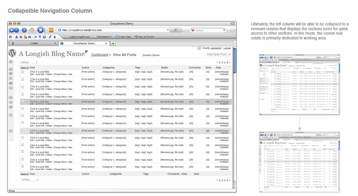
WordPress is being very open about the update to it’s administrative interface. They’ve collected a lot of input, conducted a few polls and are now revealing wireframes of the new (and evolving) interface.
Over the years, I’ve had plenty of discussions (and several arguments) about presenting wireframes to clients. Something that’s pretty familiar to a designer or programmer doesn’t come quite so easily to someone that is new to the process. I’ve found that a client can get too caught up in a wireframe and take it too literally — seeing it as an almost-final design rather than a starting point. It’s a tough process to navigate. I usually keep wireframes as internal documents, but that’s just me. There are good arguments either way.
Take a look at WordPress’ PDF presentation of the wireframe. Interesting stuff! I’m enjoying watching the process take place so publicly.
